Heathwood Developments
The brief.
Heathwood Developments needed a new identity to help to position themselves in the marketplace.
What they needed.
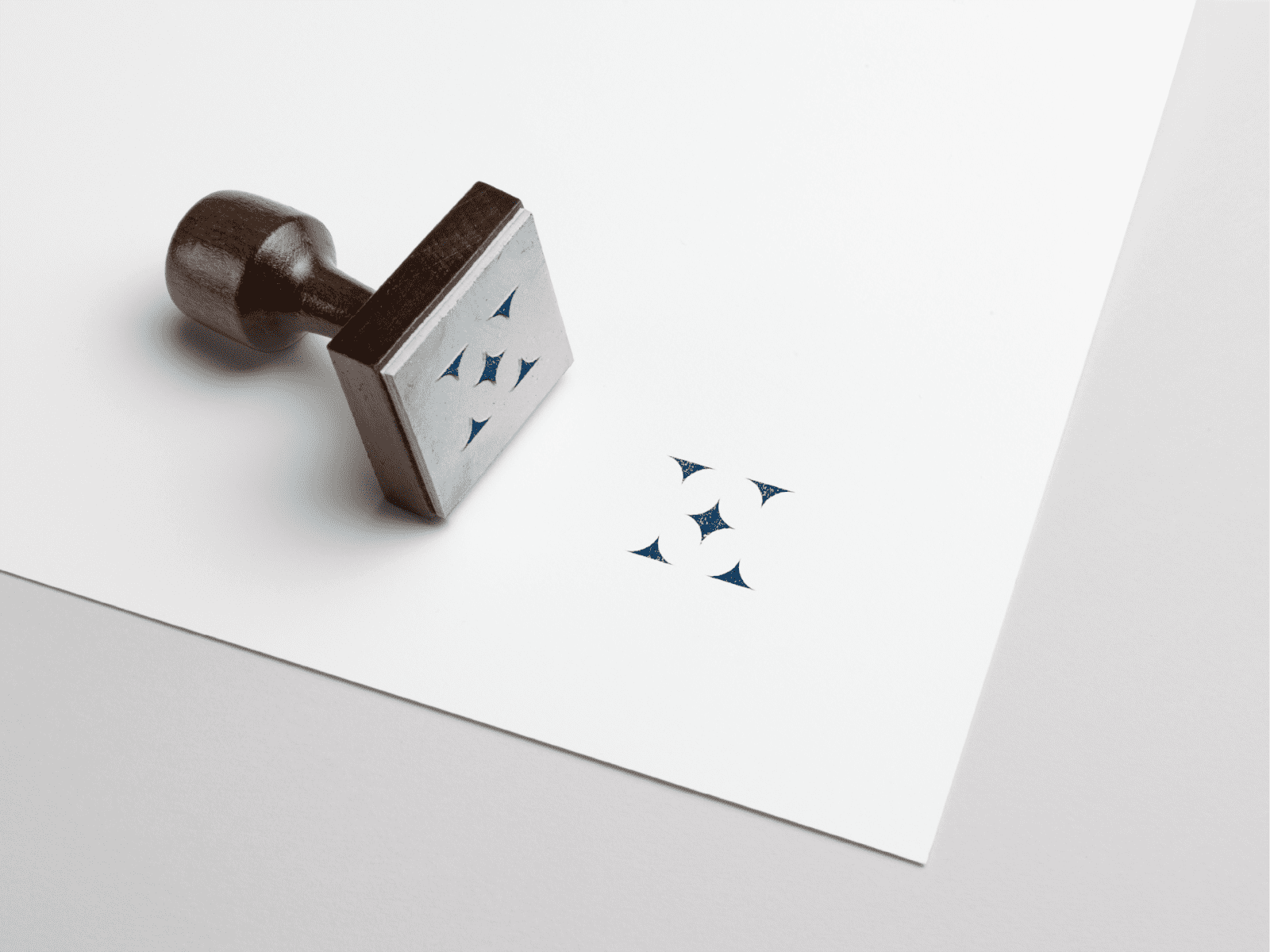
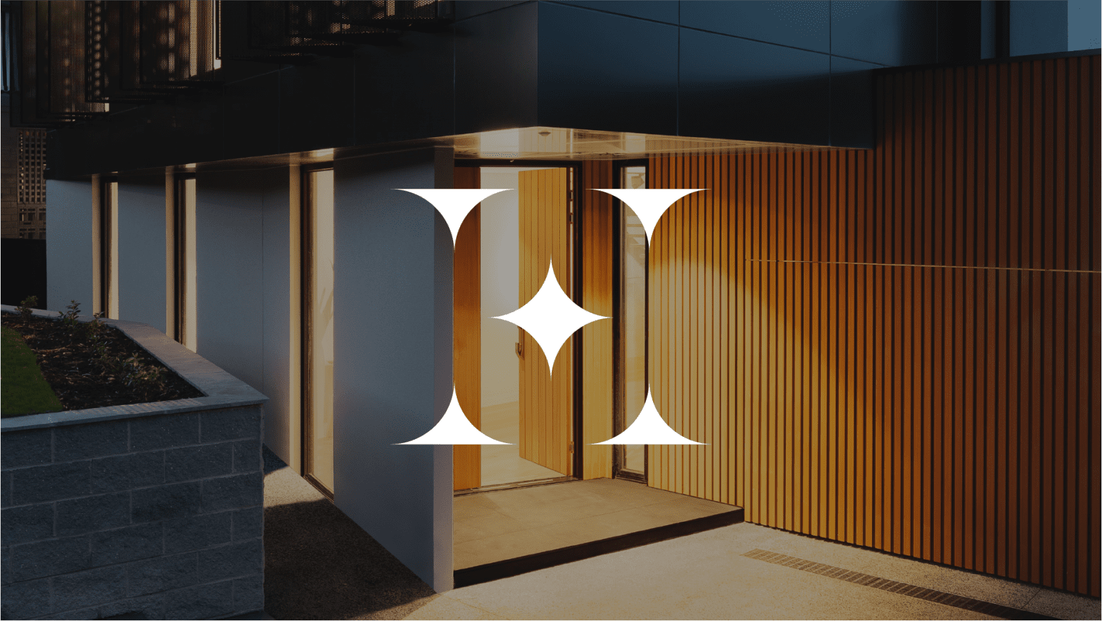
The brief was simple, and the client really leaned on us and our creative team to bring several concepts to the table. The Heathwood ‘H’ consists of simple and basic shapes, which make for a classic-looking mark. The colours contrast each other well and make for a perfect blend of modern sophistication.
Our solution.
Brand alignment
The visuals as a whole needed to be simple, the overall aesthetic and guide were made to represent professionalism. The logo needed to work on a plethora of different mediums, meaning the mark itself had to work in small and large spaces, online and off.
We utilised the shapes from the logo construction to create a pattern asset that can be used as part of the design system which makes up the visual identity.
Web & digital design
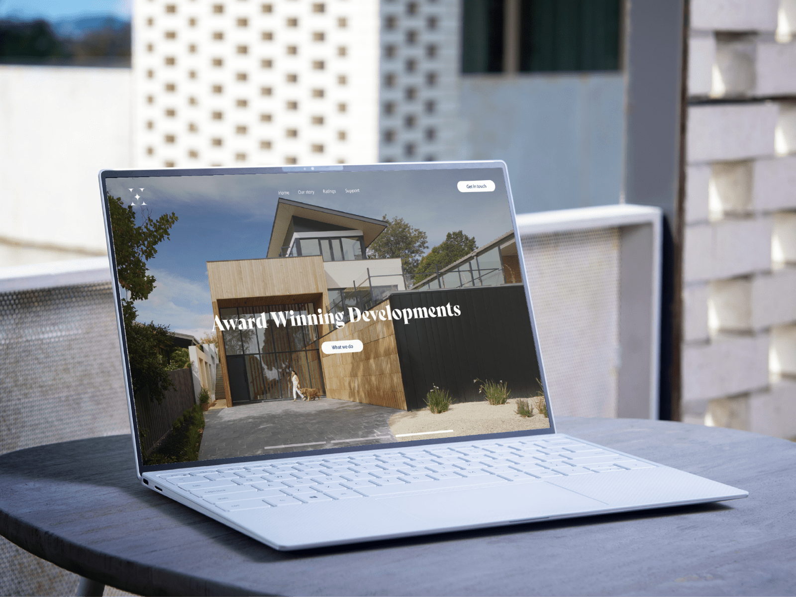
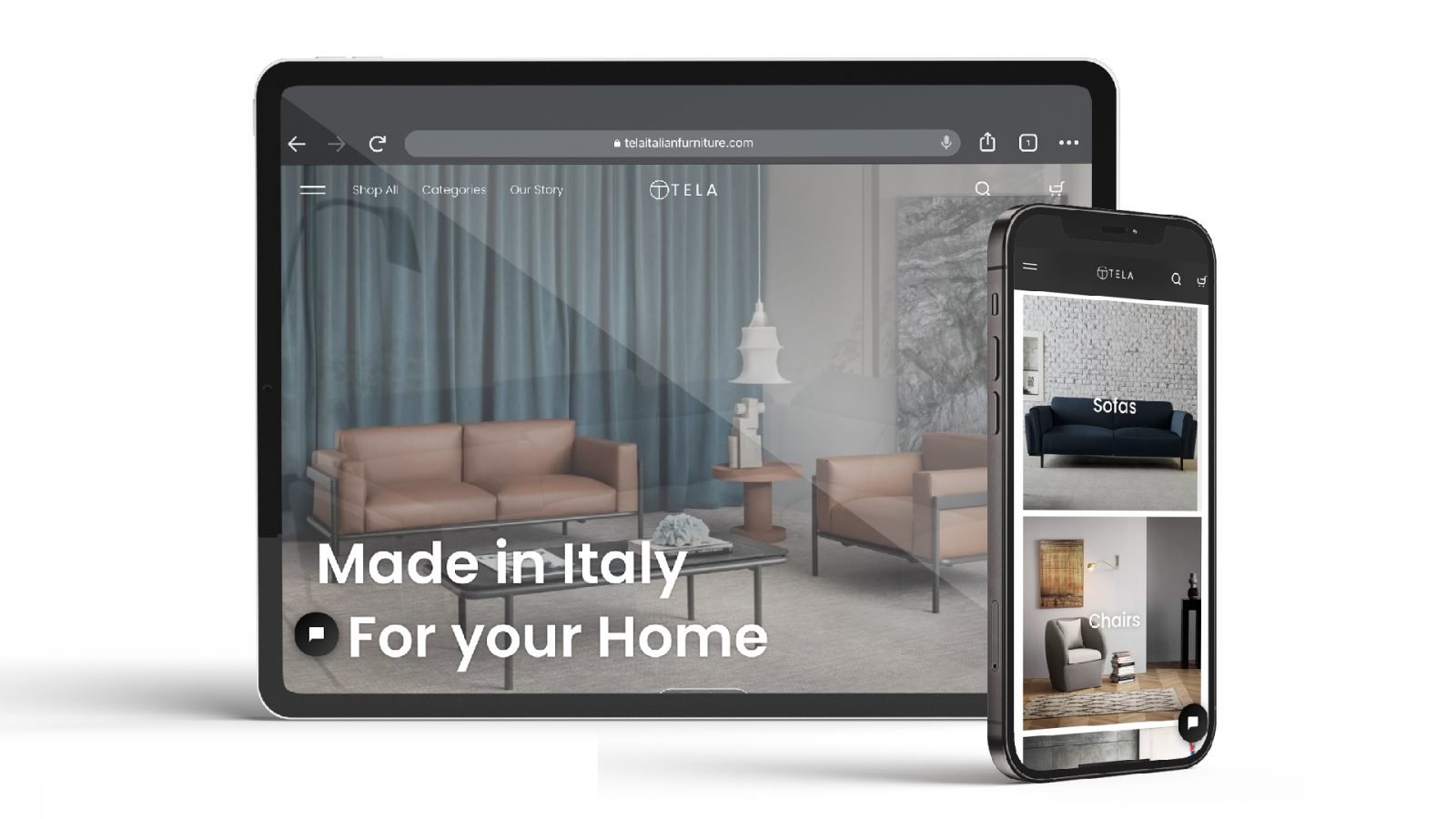
We helped create a simple and effective website, aligned with their new branding and visuals which made for an effective user experience.
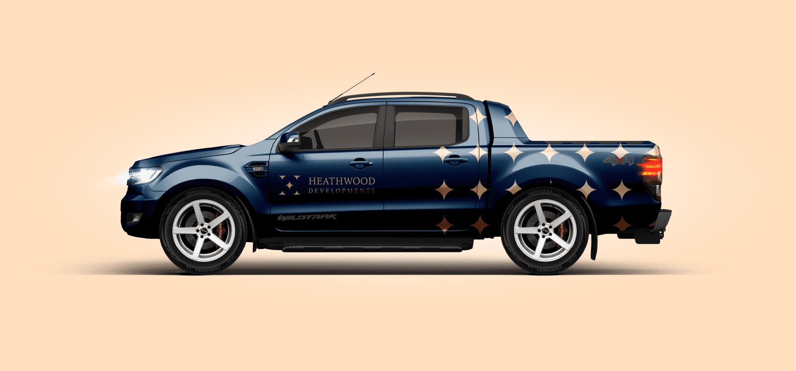
Vehicle branding.
Branding brings business, and vehicle branding is one of the most effective advertising investments you can make. We take our time and provide our customers with a bespoke design experience. We are always full of creative energy and pride ourselves on our ability to produce better designs than most generic signage companies.


