LevelUp
A quirky and engaging visual identity for a software development company based in the uk.
The brief.
LevelUp needed a new logo and identity to help support them with their planned growth and marketing aspirations. They hired a lot of contractors and developers, and the brand needed to make the company seem approachable and unique. Their internal branding was great, but their external branding and visuals needed an update.
Brand & Identity Design
Print Design
What they needed.
The visuals as a whole needed to be simple, and the overall aesthetic and guide were made to represent professionalism. The logo needed to work on a plethora of different mediums, meaning the mark itself had to work in small and large spaces, online and off.
Our solution.
Brand & identity design.
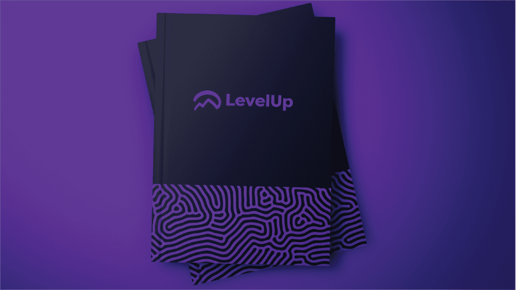
The logo mark needed to clearly represent the company’s ethos of ‘Leveling up”. The hand-drawn style mountains are there to represent the journey from start to finish, all on one line. This iconic ident was designed with the purpose of making a statement. We created an entire brand that shows off the company’s values and also gamified the style to help symbolise this ‘level up’ nature.

